How I rebuilt my portfolio with Claude
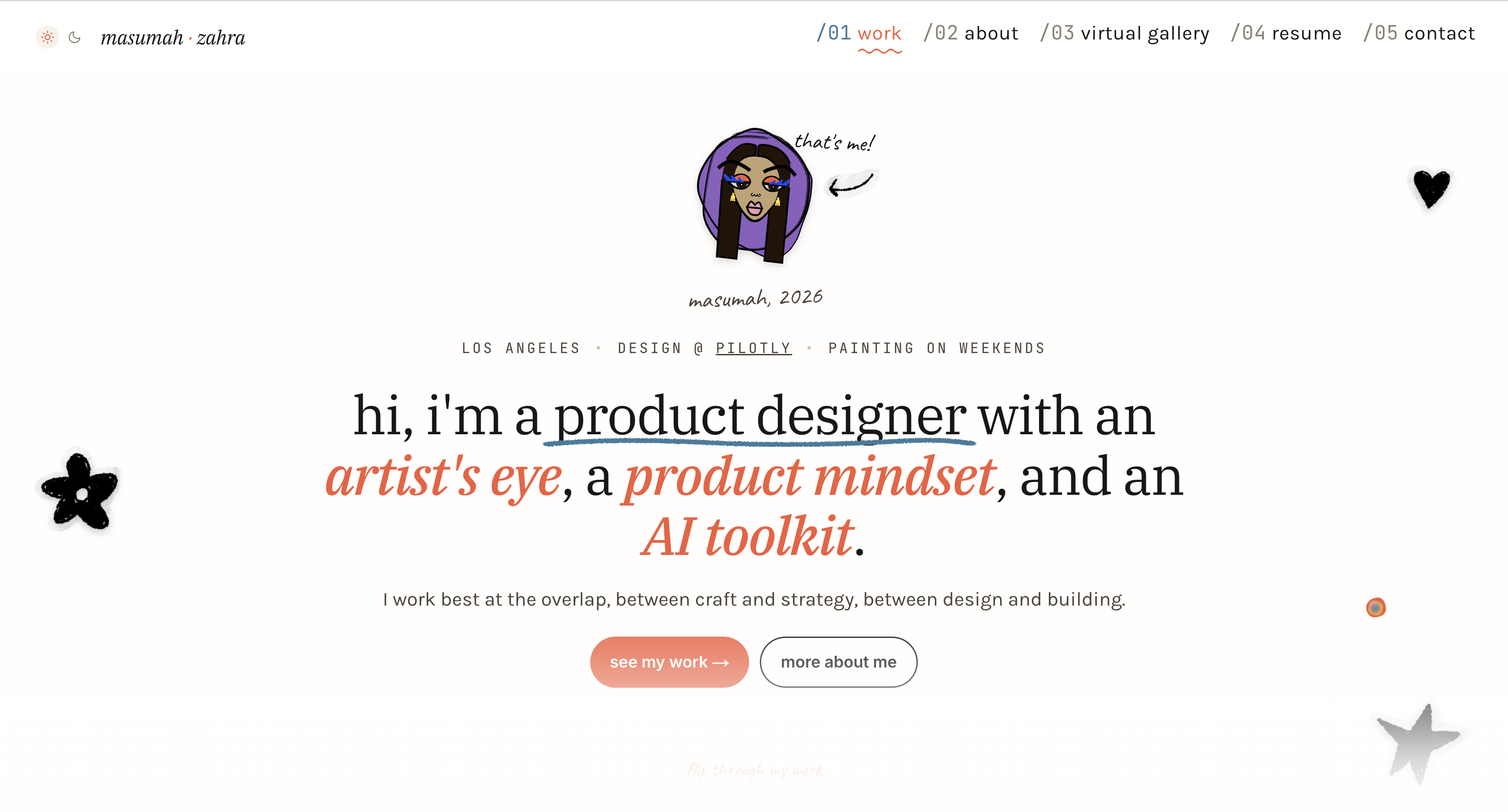
I rebranded and rebuilt my personal portfolio from scratch: directing Claude Design for ideation and Claude Code for execution. Explored 6 iterations in 2 days (vs. 1 over several months on my old site) and shipped the full site in ~1 month, with finer control over brand, code, and micro-interactions than any tool I’d used before.
what i needed from a portfolio
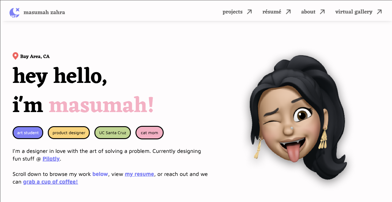
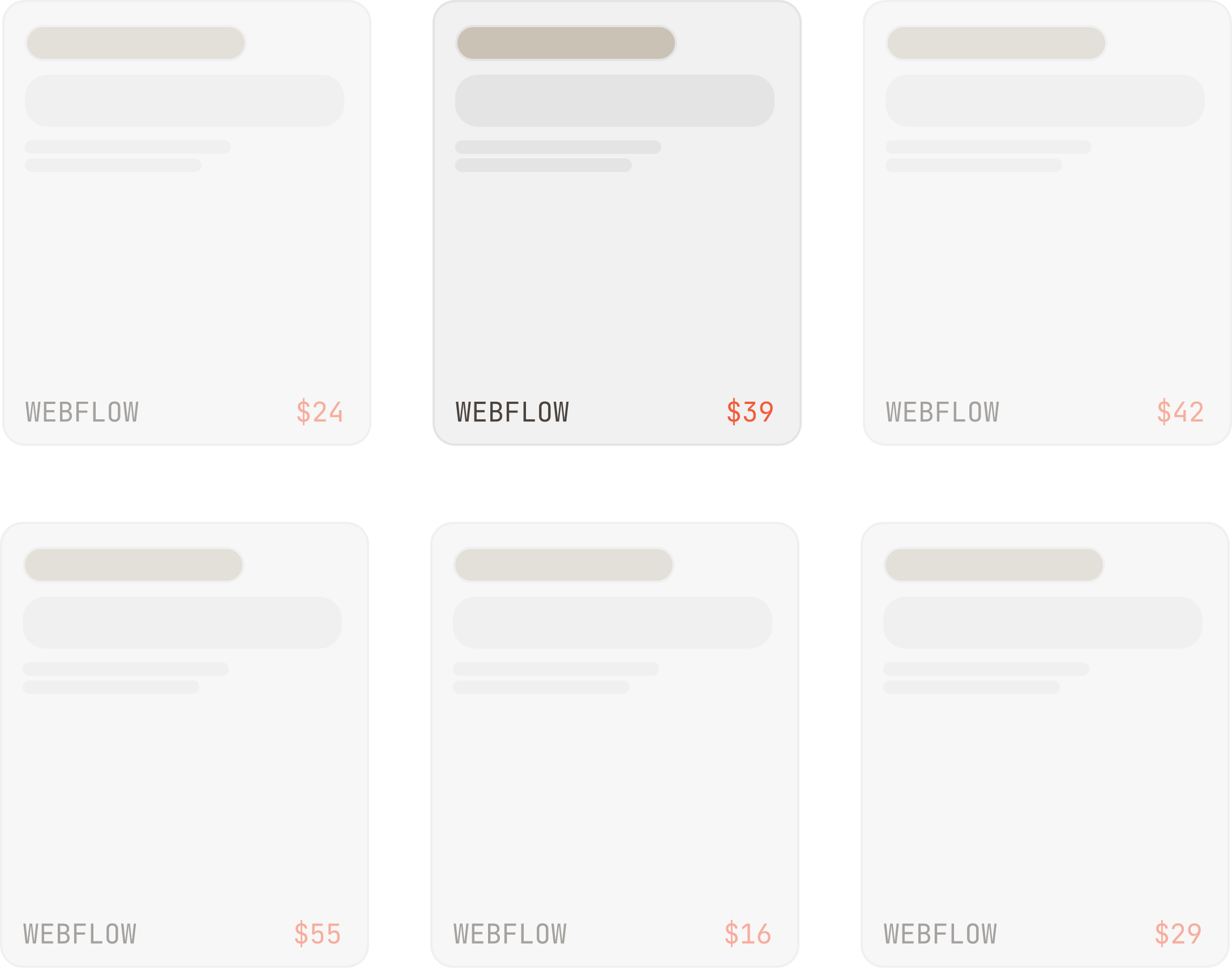
For most of the past four years, my portfolio was a patchwork of different Webflow templates I’d customized. It had a simple layout, the typography was fine, and I had a few attempts at micro-interactions that landed kind of random. It felt boring, and it didn’t feel like me.
Four years at Pilotly later, the gap between who I was when I made that site and who I am as a designer now had a big gap. I needed to redo everything. But, I kept getting overwhelmed at my previous experience designing my site:
Moodboarding, wireframing, and iterating in Figma was its own multi-week project before I could even start designing high-fidelity work.
Using a site builder like webflow to design + host was costly.
Webflow’s flexibility had a ceiling. I wanted finer control than it gave me, especially over code and interactions. I work with Claude a lot at work, and it felt like the natural choice.
blank canvas with personality
The frame I kept coming back to was blank canvas. Pilotly has been my fresh start, and I wanted the site to feel like that: open, uncluttered, room to show what I’ve put on it.
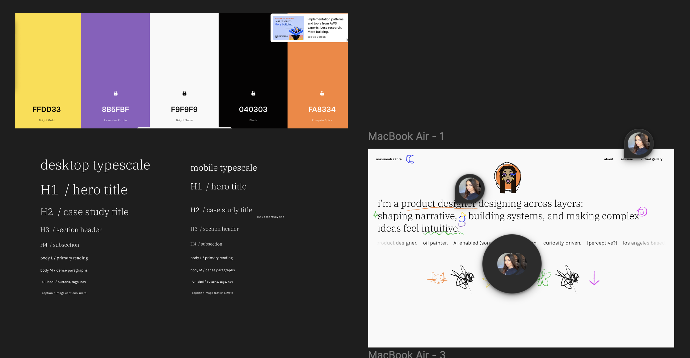
But I’m still an artist, a maximalist, I dress in color, I love texture in my work and in my outfits. So, the canvas had to have pops of color and personality. And because I’m scrappy, the type of designer who has to move quickly, sketch a lot, and talk my way to an idea, I leaned into hand-drawn motifs. The doodles in the margins, the avatar at the top of the landing page, and the doodle background behind my portrait on the About page are all mine.
I wanted whoever lands on the site to feel like they’re inside my sketchbook. I wanted them to see how I think and where the ideas come from.
figma, then claude design
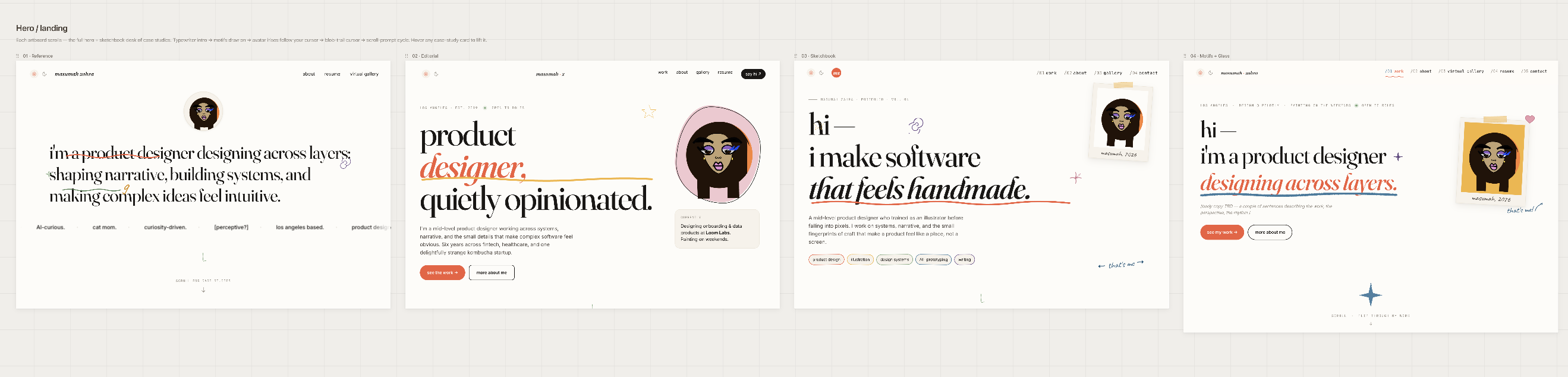
I sketched a few rough directions in Figma, then moved to Claude Design to iterate faster.
In two days, I explored six iterations across four directions: close to my reference, editorial, sketchbook, and glass-y. On my old portfolio, I’d explored one direction, and it took several months to design, write, and ship. Every Claude iteration came back feeling minimalist, and were all tasteful and clean, but just not me.
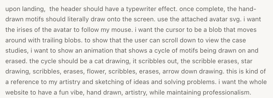
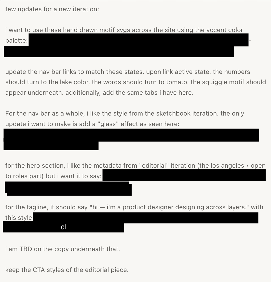
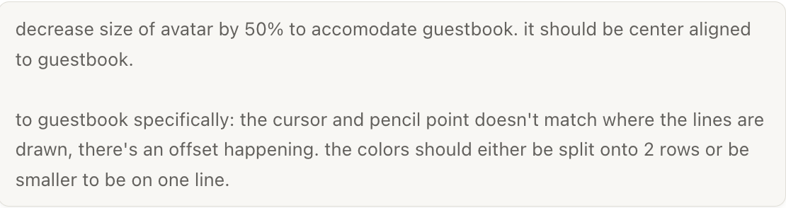
The first useful thing I learned was knowing I could push against Claude instead of accepting what looked “safe.” I narrowed in on sketchbook and started prompting more specifically: reference images, specific interactions, specific vibes. I’d ask for a few iterations, focus on one or two I liked, and ask Claude to justify why it made certain choices. That gave me a fast read on whether decisions were intentional or just defaults.
I wasn’t trying to get production-ready files out of Claude Design. I was using it the way I use my actual sketchbook, which is fast and messy. The moodboarding, wireframing, and sketching phases of a normal design process were happening at once, inside the chat.
Going back to the drawing board became something I could do in a few hours, not a week.
claude design as sketchbook, claude code as scalpel
Once I had a direction I trusted, I moved into Claude Code. Most of the time I was telling it what I wanted, reviewing what it gave me, asking for adjustments.
Claude Code is better than Claude Design at scoped changes. When I asked for one thing, it did one thing. I started using the two tools differently: Claude Design as my sketchbook (ideation, breadth, “what if”); Claude Code as my scalpel (this exact thing, leave the rest alone).
I usually use Claude Code in terminal for work, but tried it in the app this time. Making a change and seeing it locally without leaving the window made the loop tight; front-end has always felt like the closest tool to a designer’s brain. With this combo, it was finally accessible to me at the level I wanted.
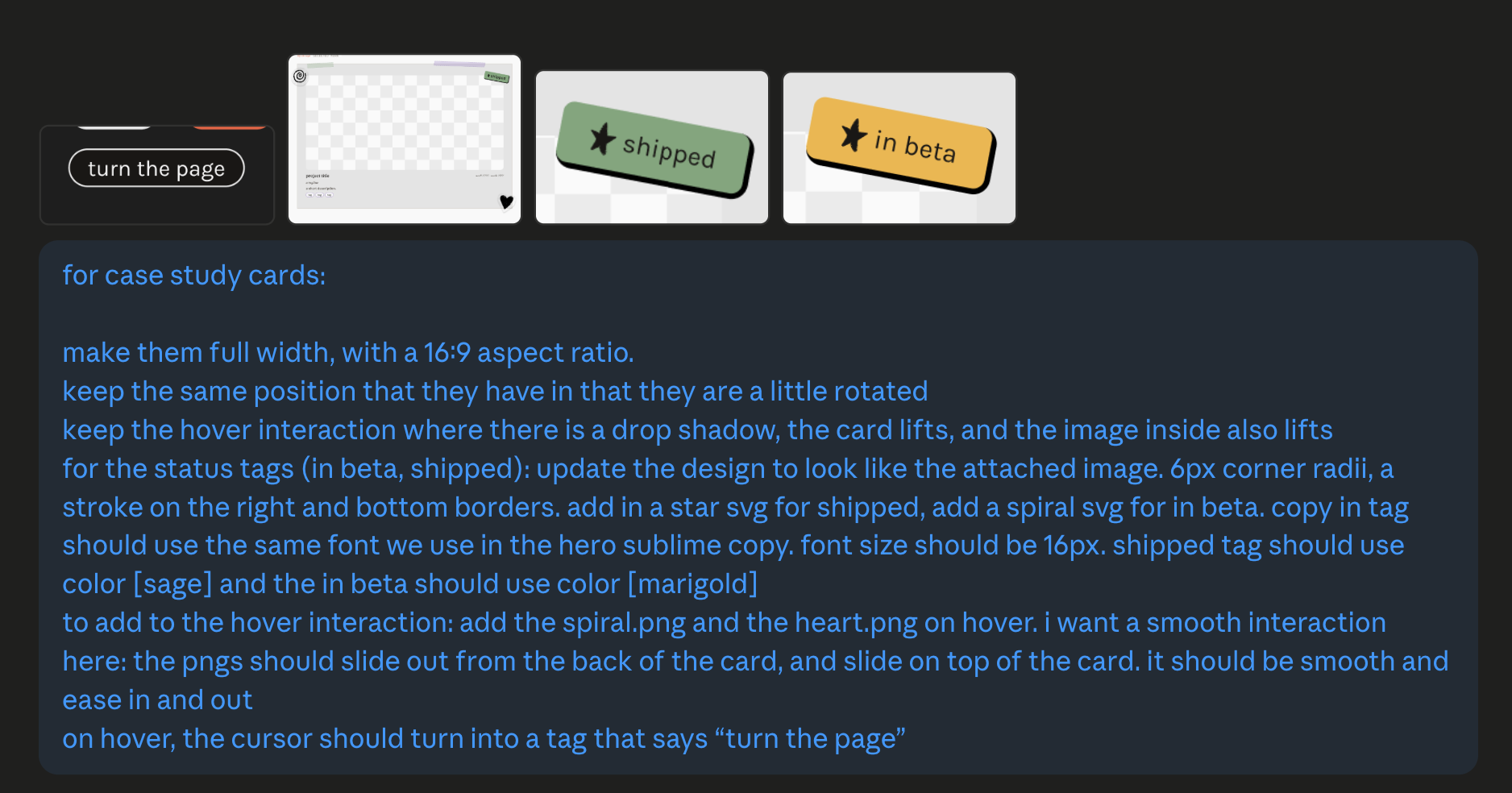
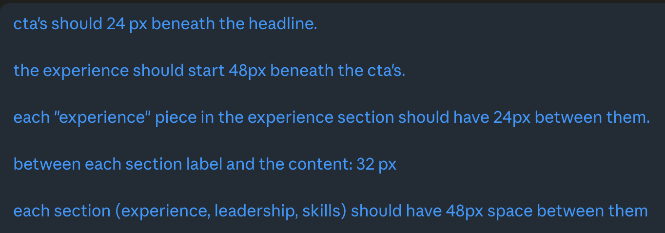
from google doc to live page
Once a case study’s copy and imagery were finalized, the old publishing step went like this: manually enter in all of the copy + imagery into the case study template in Webflow, re-tweaking the layout if it wasn’t responsive, and adjusting across all device types. With Claude Code, everything was handled for me.
I’d finalize my piece in a Google Doc, export it as a Markdown, and drop it, along with the imagery, into a folder. Claude already knew my case study template. Within minutes, the full page was rendered.
The time I used to lose to tedious formatting in Figma and Webflow went back to the most important part: the prose and the narrative.
micro-interactions i finally had time for
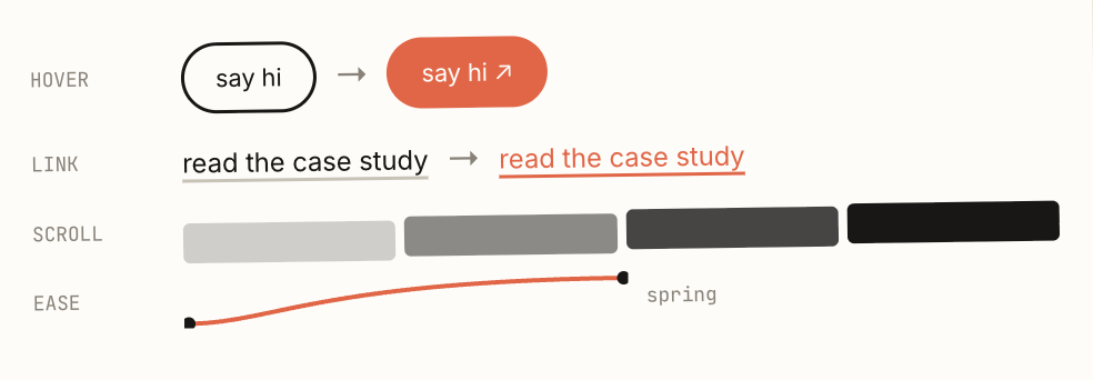
The part I’m so glad I could work on: micro-interactions.
How does this button feel when I hover? How does the page transition? How does content fade in as you scroll? These details have always mattered to me. But on my previous portfolio, I ran out of time, patience, or resources before I could focus on them. Writing the case studies and figuring out the general design ate everything.
With Claude Design and Claude Code, I had room. The detail work that used to get cut for time was the part I could finally obsess over.
i drove, claude was the tool
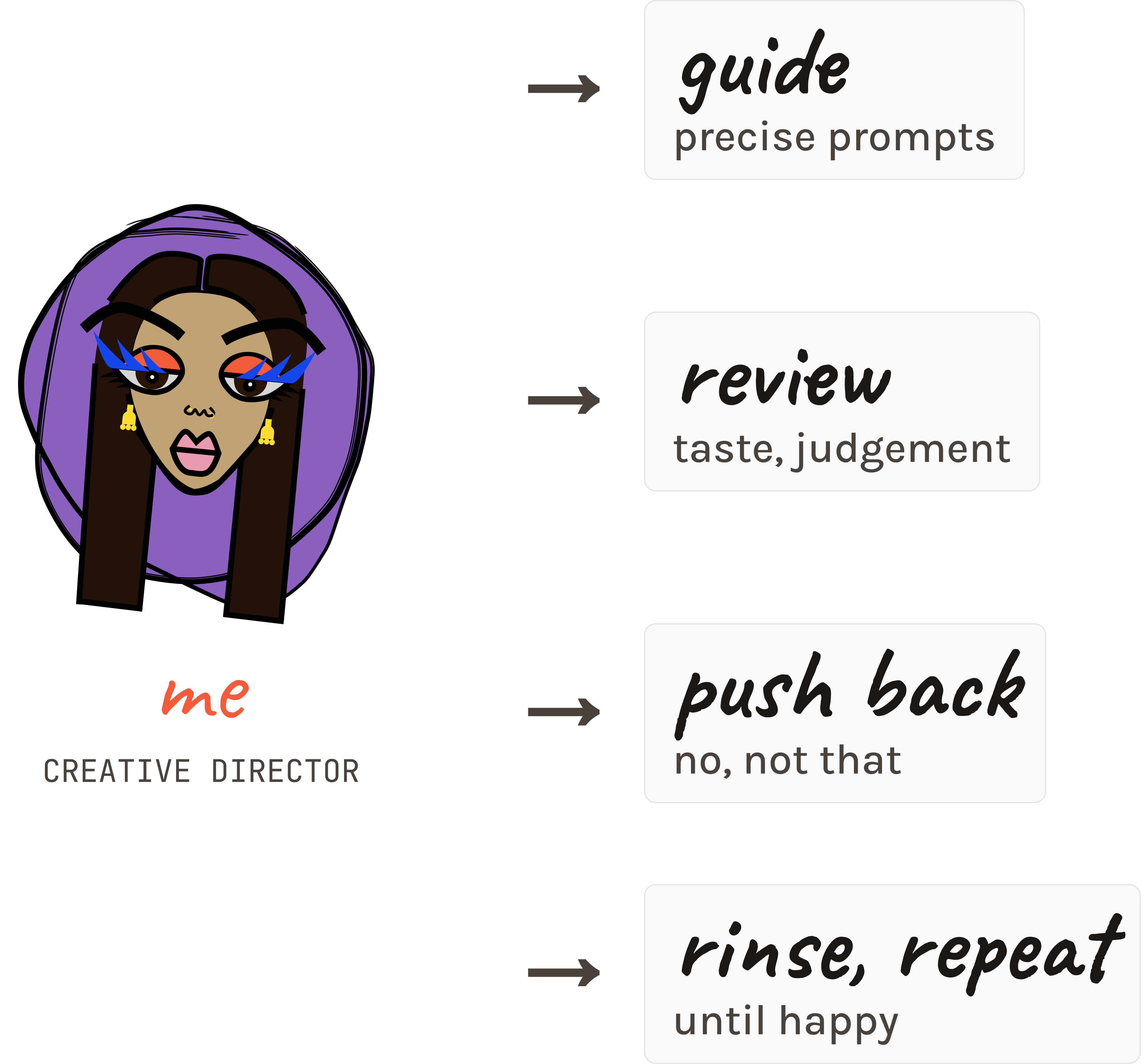
Claude was a tool that I used to get to a better outcome, faster, with more control than I’d ever had on a personal project. I got to think of myself not as only a visual designer, an experience designer, a product designer, or a developer, but an all-encompassing Creative Director. I thought of something, guided Claude, pushed back, rinsed, and repeated until I was happy.
The skill that made any of this work was knowing how to prompt. It’s a skill I’d been building at Pilotly for the past six months, working with AI on our dashboard. I’d learned how to be precise about what I wanted, how much context to give, and when to push back when Claude was confidently wrong.
Claude sounds smart, which means it can sneakily suggest things that don’t make sense: font sizes that don’t feel right, motifs placed where I didn’t ask, a balanced layout when it wasn’t.
what i took with me
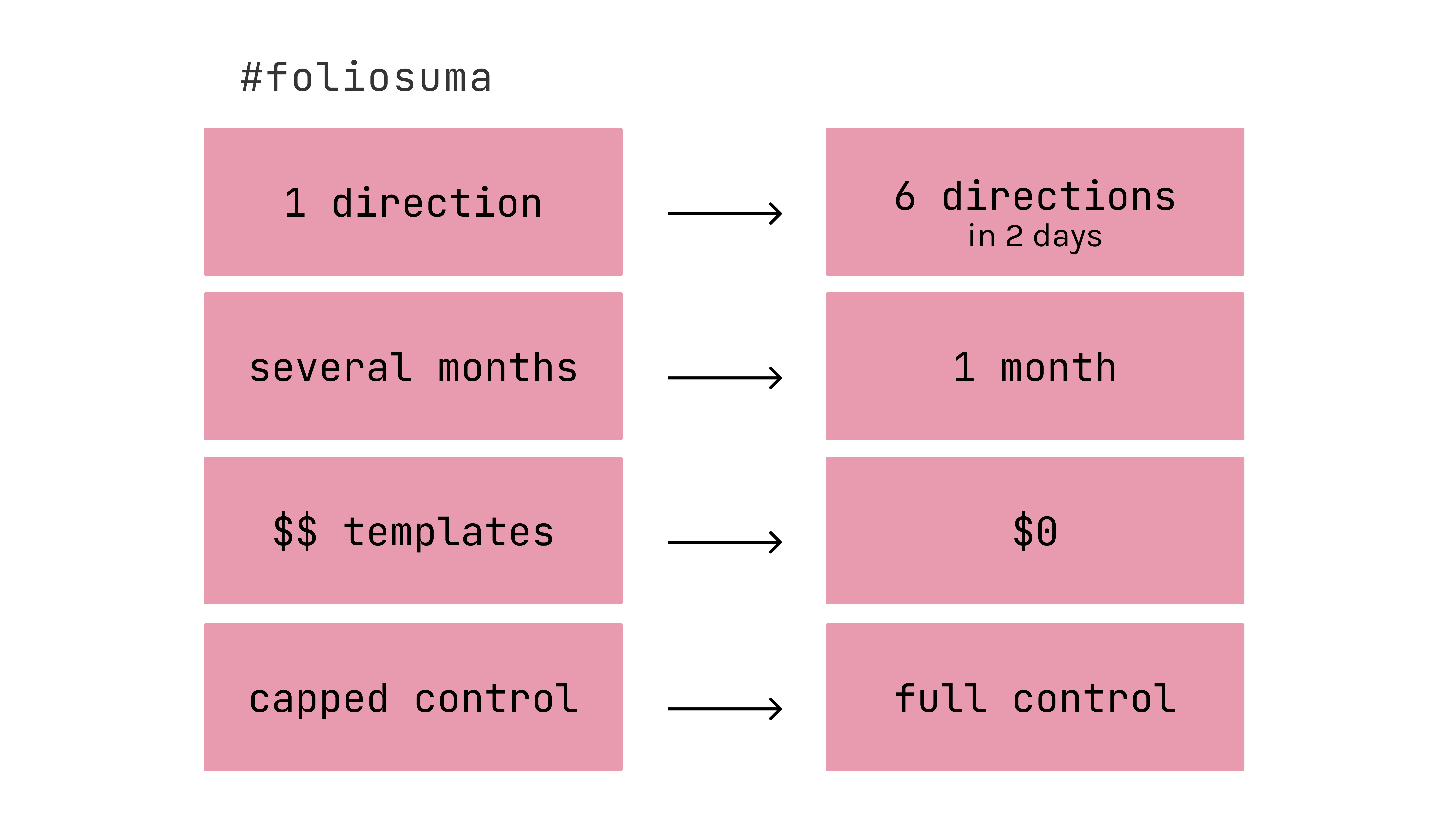
one direction, several months, paid templates, capped tooling.
six iterations in two days, the full site shipped in a month with full control.
But the real takeaway isn’t about cost or speed. It’s about where my time goes now.
The real reflection is where my time goes now. The moodboarding-wireframing-sketching phase that used to eat most of the work happened in the prompt window. The Webflow-template-or-nothing tradeoff disappeared. The hours I used to spend on general design got reallocated to the details I’d always wanted to focus on— micro-interactions, type, the feel of a hover.
What didn’t change: I still had to know what I wanted. I still had to look at a thing Claude made and decide whether it was right. The taste part, the discernment, the “no, not that”, is still all mine.

 see my work →
 read project no. 1